Introduction to Sinhala Typography
Typography plays a crucial role in graphic design, particularly in the realm of social media where visual communication is essential. In the context of Sinhala typography, it presents a unique opportunity to connect with an audience that resonates with their cultural heritage. As social media platforms continue to evolve, the need for visually compelling content has never been greater. Custom Sinhala fonts can significantly enhance a brand’s identity while reflecting the nuances of Sri Lankan culture.
The use of Sinhala typography in social media content can foster authenticity and engagement among users. By incorporating regional scripts and styles, designers can create posts that resonate more deeply with their target audience, thereby enhancing cultural connection. This approach is not merely aesthetic; it allows brands to establish a more personal relationship with their followers by valuing and celebrating local traditions. With the vast array of different tools available for graphic design, the potential for creating striking visual content is immense.
Custom typography can include various styles, whether traditional or modern, and can be tailored to fit the message being conveyed. For instance, playful fonts might be used for a casual campaign, while more elegant options may suit formal announcements. By thoughtfully selecting Sinhala fonts that align with a brand’s tone, designers can elevate social media content, making it more memorable and impactful.
Moreover, integrating diverse graphics with unique typography can further enhance the overall visual storytelling of a post. Engaging visuals combined with well-crafted Sinhala text not only draw attention but also enhance the effectiveness of the communication. Each element must work harmoniously to create posts that not only inform but also inspire. Investing time into custom Sinhala typography can yield significant benefits, fostering a deeper connection with audiences on social media platforms.
Choosing the Right Sinhala Fonts
The selection of appropriate Sinhala fonts plays a crucial role in developing visually compelling graphics for social media platforms. When considering different fonts, it is essential to focus on their readability, as viewers should easily interpret the text. Three popular fonts frequently used in creating custom typography are FM Abhaya, Iskoola Pota, and Noto Sans Sinhala. Each of these fonts offers unique characteristics that cater to distinct aesthetic and functional needs.
FM Abhaya is a modern font that combines traditional and contemporary design elements. Its clarity enhances readability, making it suitable for both digital and print mediums. This font can effectively convey a casual yet professional tone, aligning well with various brand identities. On the other hand, Iskoola Pota is a widely recognized font among Sinhala users, renowned for its formal style. This font enhances a sense of authenticity, making it ideal for educational materials, official communications, and formal marketing campaigns.
Noto Sans Sinhala stands out for its versatility; it ensures compatibility across various devices and screen sizes. This cross-platform consistency is paramount in today’s social media landscape, where audiences engage with content from multiple devices. The selection of a font must align with the tone of your brand, whether it leans toward being formal, casual, or artistic. Adopting a font that reflects your brand’s personality allows for a stronger cultural connection with your audience.
In conclusion, choosing the appropriate Sinhala fonts involves more than mere aesthetics. It is a strategic decision that impacts the effectiveness of your communication in the realm of social media. By using popular fonts like FM Abhaya, Iskoola Pota, and Noto Sans Sinhala, creators can ensure their typography enhances the overall user experience while accurately representing their brand’s identity.
Essential Tools for Typography Design
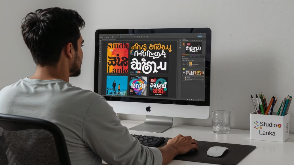
Typography design is a critical element in creating engaging graphics for social media, especially when focusing on unique languages like Sinhala. To achieve visually compelling designs that resonate well with audiences, several tools stand out as indispensable for designers. This section will explore three prominent tools: Canva, Adobe Illustrator, and Figma, detailing their key features and benefits.
Canva is an popular online design platform that provides users with a user-friendly interface and a wide range of templates. It is particularly effective for beginners and those seeking to create quick, visually appealing social media graphics without extensive design knowledge. Canva supports various Sinhala fonts, allowing users to customize typography easily. Its drag-and-drop functionality simplifies the process of laying out text and images, making it an excellent starting point for anyone interested in typography design.
Adobe Illustrator, on the other hand, offers advanced features for professional designers. This vector-based software allows for precise manipulation of text, enabling creators to design intricate typography that stands out. With a focus on scalability, designs remain sharp and clear at any size, which is crucial for various social media platforms. Its comprehensive font options and support for custom Sinhala fonts empower designers to develop unique typographic styles that maintain cultural connections.
Lastly, Figma combines collaborative design features with powerful typography tools, making it ideal for teams. This browser-based application allows multiple users to work simultaneously on typography projects, ensuring feedback and revisions can occur in real-time. Figma also supports a wide array of plugins that may enhance font usage, including Sinhala typography integration. Such tools facilitate collaboration and streamline the design process, aiding in the creation of custom graphics that engage audiences effectively.
Customizing Typography for Impact
Creating visually compelling typography is an essential aspect of designing for social media, particularly when incorporating Sinhala fonts. Customizing various typographic elements, including kerning, leading, and font weight, significantly enhances the overall impact of text. These adjustments not only improve readability but also allow designers to convey the intended message more effectively. For instance, proper kerning, which refers to the spacing between individual characters, can transform a standard text into a more appealing graphic element, ensuring that it captures attention amid crowded social media feeds.
Leading, or the vertical space between lines of text, plays a critical role in typography as well. Appropriate leading can make text feel more open and readable, which is particularly important when using intricate Sinhala fonts that may have specific character combinations. Customizing letter spacing and line height creates a balance between text and surrounding visuals, making the content more inviting and engaging for users. Additionally, adjusting the font weight can add emphasis to particular words or phrases, enabling content creators to guide the viewer’s focus throughout the text.
Beyond basic typographic adjustments, incorporating visual effects such as shadows, outlines, gradients, and textures can elevate the overall design. Shadow effects add depth, creating a sense of dimension that can make text pop and enhance its visibility. Outlining text with contrasting colors can improve clarity, especially when placed over busy backgrounds often found in social media graphics. Similarly, gradients and textured backgrounds can foster a cultural connection, resonating with audiences by reflecting local aesthetics and preferences.
Ultimately, mastering the customization of typography through these different tools allows designers to craft effective social media graphics that resonate with viewers while highlighting cultural nuances inherent in Sinhala typography.
Exporting and Utilizing Your Typography
Once you have created your custom Sinhala typography, the next step is to export it properly to ensure effective utilization across various platforms, particularly on social media. One recommended format for exporting your typography designs is the transparent PNG. This format allows for a seamless overlay when placed on images or videos, enabling your graphics to maintain their integrity and visual appeal regardless of the background.
When saving your typography in PNG format, it is crucial to consider the colors and details of your design, particularly with Sinhala fonts, which can be intricate. Ensure that your typography is sharp and clear, preserving the essential aesthetics you aimed for during the design process. It is advisable to use different tools like Adobe Photoshop, Illustrator, or online graphic design platforms to achieve the best quality in your exports.
Another vital aspect to consider is the optimization of file sizes for web use. Large file sizes can lead to slow loading times on social media platforms, which may result in a poor user experience and reduced engagement. To optimize your typography graphics, you can use file compression tools that maintain quality while reducing the size. This balance is essential not just for aesthetic purposes but also for effective social media management, ensuring that your creations are fast-loading and visually compelling.
By focusing on high-quality exports and optimized file sizes, your custom Sinhala typography can significantly enhance your social media presence. This approach not only creates a strong cultural connection with your audience but can also improve the overall impact of your graphics, driving engagement and interaction with your posts.
Design Tips for Sinhala Creators
When creating custom Sinhala typography for social media, it is essential to prioritize mobile readability. Given the increasing consumption of visual content on mobile devices, designing graphics that are legible on smaller screens is crucial. Opt for clear, bold fonts that maintain their readability even at reduced sizes. Since Sinhala script can often be intricate, simplifying certain characters can enhance readability without compromising the aesthetic appeal of the text.
Utilizing culturally inspired color palettes can significantly enhance the visual impact of your designs. Bright hues, such as yellows, greens, and reds, resonate deeply within Sri Lankan culture and can evoke emotional connections with the audience. These colors not only capture attention but also create a sense of familiarity and nostalgia that strengthens the cultural connection with viewers. An effective color scheme can amplify the visual appeal of your social media graphics and enhance the overall user experience when they engage with your content.
Maintaining consistent typography styles across various platforms is vital for brand recognition. Whether you choose a traditional font that reflects the Sinhala language’s heritage or a more contemporary style, consistency will help users identify your brand. Consider creating a set of typographic guidelines for different formats, such as captions, headlines, and call-to-action buttons. This consistency allows for a unified appearance across your social media presence, reinforcing your branding while making your content visually compelling.
Incorporating different tools can significantly simplify the design process. Platforms such as Canva or Adobe Creative Suite offer features that enable creators to play with typography easily, testing how well their designs resonate with their audience. By leveraging these resources effectively, Sinhala creators can produce high-quality graphics that are both visually attractive and culturally meaningful.
Case Studies of Successful Sinhala Typography
In the evolving landscape of social media, the integration of visually compelling Sinhala typography has proven to be a vital element in enhancing audience engagement and reinforcing brand identity. This section examines notable case studies that illustrate the effective utilization of Sinhala fonts across various social media platforms.
One prominent example comes from a local Sri Lankan beverage brand that successfully leveraged Sinhala typography in their Instagram campaigns. By choosing bold and playful fonts, they implemented typography that harmonized with the product’s youthful image. The graphics were further complemented by vibrant colors and engaging visuals, creating a culturally immersive experience. This strategy not only attracted attention but also fostered a strong cultural connection with the audience, leading to a significant increase in brand followers and product inquiries.
Another inspiring case is a non-profit organization focused on promoting environmental awareness. Their campaign utilized Sinhala typography tailored for concise and impactful messaging. The graphics were designed to communicate urgency and hope simultaneously, making them not just visually appealing but also emotionally resonant. This thoughtful approach resulted in increased shares and comments across social media, effectively spreading their message far beyond their immediate audience.
Furthermore, a digital marketing agency examined the effectiveness of various tools in creating unique Sinhala typography for clients in fashion and lifestyle sectors. Their use of custom fonts that reflected local culture allowed brands to stand out in a crowded market. The analysis revealed that incorporating Sinhala typography not only enhanced the uniqueness of the brand’s message but also contributed significantly to an increase in engagement metrics, such as likes and shares on their posts.
These case studies underscore the importance of utilizing well-thought-out Sinhala typography in social media. By harnessing its potential, brands can create graphics that not only captivate audiences but also foster a meaningful cultural connection, leading to enhanced brand loyalty and awareness.
Common Mistakes to Avoid in Typography Design
When embarking on the journey of designing custom Sinhala typography for social media, it is essential to be aware of common pitfalls that can compromise the effectiveness of your graphics. One of the most significant errors is poor readability. Typography should be visually compelling and easily legible to ensure that your message resonates with the audience. This is particularly crucial in social media, where users typically skim through content quickly. Using overly complex or ornate fonts without considering the legibility can detract from the viewer’s experience, making it vital to prioritize clarity.
Another common mistake is the overuse of effects such as shadows, gradients, or outlines. While these effects can enhance the visual appeal of your design, excessive application can lead to a cluttered appearance that distracts from the core message. Moderation is key; opting for a clean design approach will help maintain the focus on the typography itself without overwhelming the viewer.
Consistency in font usage is also crucial in maintaining brand identity and ensuring a coherent look across different posts. Mixing too many styles or failing to adhere to a predefined typographic system can confuse the audience and dilute your brand’s message. Choose a limited subset of Sinhala fonts that harmonize with your overall visual strategy, and use them consistently to create a unified aesthetic.
Considering the target audience’s preferences when design choices are made is another critical aspect. Each demographic may have specific tastes and cultural connections that influence their perception of typography. By understanding these preferences, you can create designs that resonate better with your audience. Utilizing different tools available for typography design can also aid in avoiding these mistakes, ensuring that your creations are both visually compelling and effective for social media engagement.
Conclusion and Further Learning
Mastering the art of Sinhala typography is essential for creating visually compelling graphics tailored for social media. The importance of integrating culturally relevant design elements cannot be overstated, as they contribute to a unique identity that resonates with a specific audience. By understanding and applying the principles of typography in your social media content, you can foster a deeper cultural connection with your viewers, ensuring that your messages are both clear and impactful.
Throughout this guide, we explored various tools and techniques for designing custom Sinhala fonts, focusing on how to create compelling visuals that enhance your online presence. The careful selection of typography not only contributes to the aesthetics of your posts but also impacts the readability and effectiveness of your messaging. With different tools available, from advanced software to user-friendly applications, aspiring designers have access to numerous resources that can help elevate their typography skills.
As you embark on your journey to master Sinhala typography, it is crucial to experiment with different styles and layouts. Allowing creativity to guide your design process will lead to unique solutions that stand out on social media. Engage with communities focused on typography to exchange ideas, share experiences, and gain insights into contemporary trends. Online courses, webinars, and design forums are excellent platforms for further learning, providing in-depth knowledge and hands-on experience in typography design.
By continuously honing your skills and staying abreast of the latest developments in graphic design, you can create powerful social media content that not only captures attention but also communicates effectively to your target audience. This combination of technical skill and cultural insight will serve you well in your endeavor to create impactful designs that resonate within the Sinhala-speaking community.